Mobile-first shopping flows and a full site redesign for PAIGE Denim.
I led UX design across PAIGE's live e-commerce experience and V2 redesign — owning navigation, PDP, cart, and omnichannel features like Find in Store and BOPIS. I also served as internal design lead for V2, partnering with stakeholders, an agency, and engineering from concept through handoff.
PAIGE
UX/UI Designer
2022
Improving the PAIGE Experience
Improving the PAIGE experience meant addressing friction across the shopping journey, particularly on mobile, where customers often struggled with discovery, fit confidence, and store availability. I focused on simplifying complex decisions by clarifying navigation, surfacing the right information at the right moment, and reducing unnecessary steps between browsing and checkout. The desired outcome was a more confident, efficient shopping experience that supported both online conversion and in-store engagement while establishing a foundation that could scale with the business.
Ideating Flows & User Journey
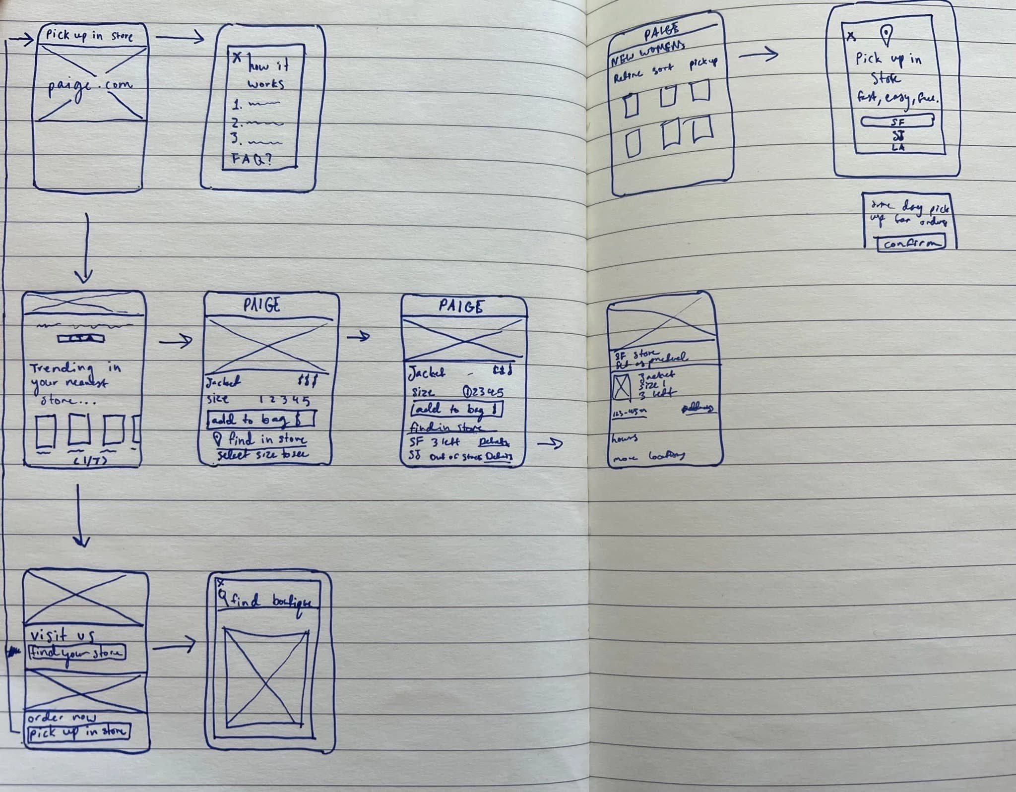
The work began with a collaborative, ground-up approach, auditing the existing experience and evaluating it against competitive research to understand gaps, limitations, and opportunities. Early UX frameworks and visual explorations, including detailed wireframes, were developed to establish direction and presented to stakeholders for alignment and sign-off on initial concepts. Wireframing played a critical role in this process, serving as the blueprint for user flows, content hierarchy, and navigation across the site. The process then moved through multiple rounds of iteration, with close attention paid to defining the happy path as well as edge cases across key flows. Throughout development, these wireframes and designs were continuously refined in partnership with stakeholders and engineering to ensure feasibility, consistency, and a clear translation from early ideas into a fully realized, build-ready experience.
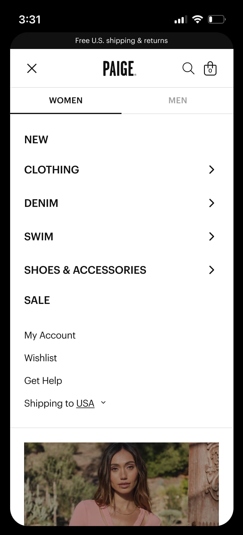
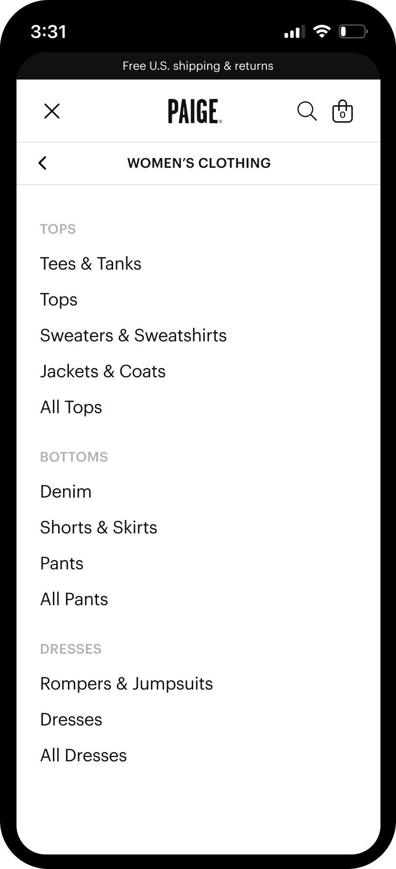
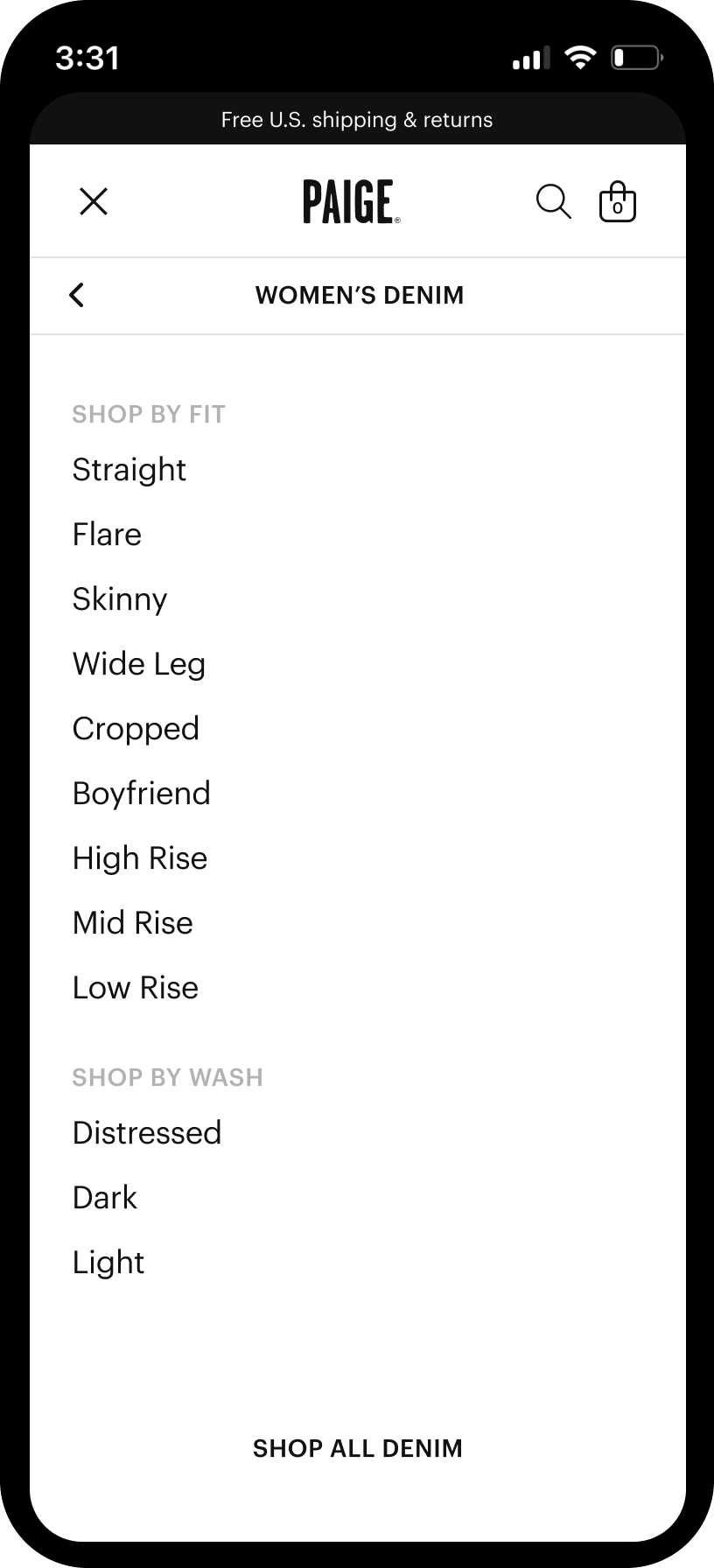
Navigation
The navigation was fully redesigned with a strong emphasis on mobile usability, making it easier for customers to find products quickly. Desktop and mobile navigation were treated as distinct experiences based on platform-specific behaviors, with a new mega nav and mobile navigation that clarified category structure, supported evolving content needs, and created a scalable foundation for future growth.
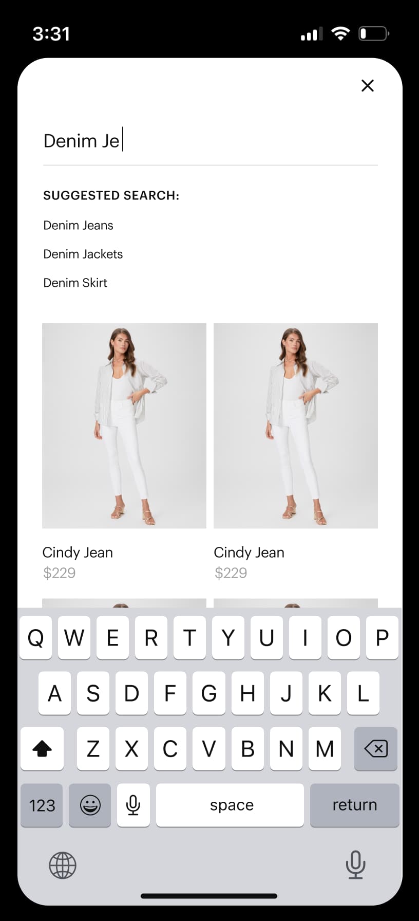
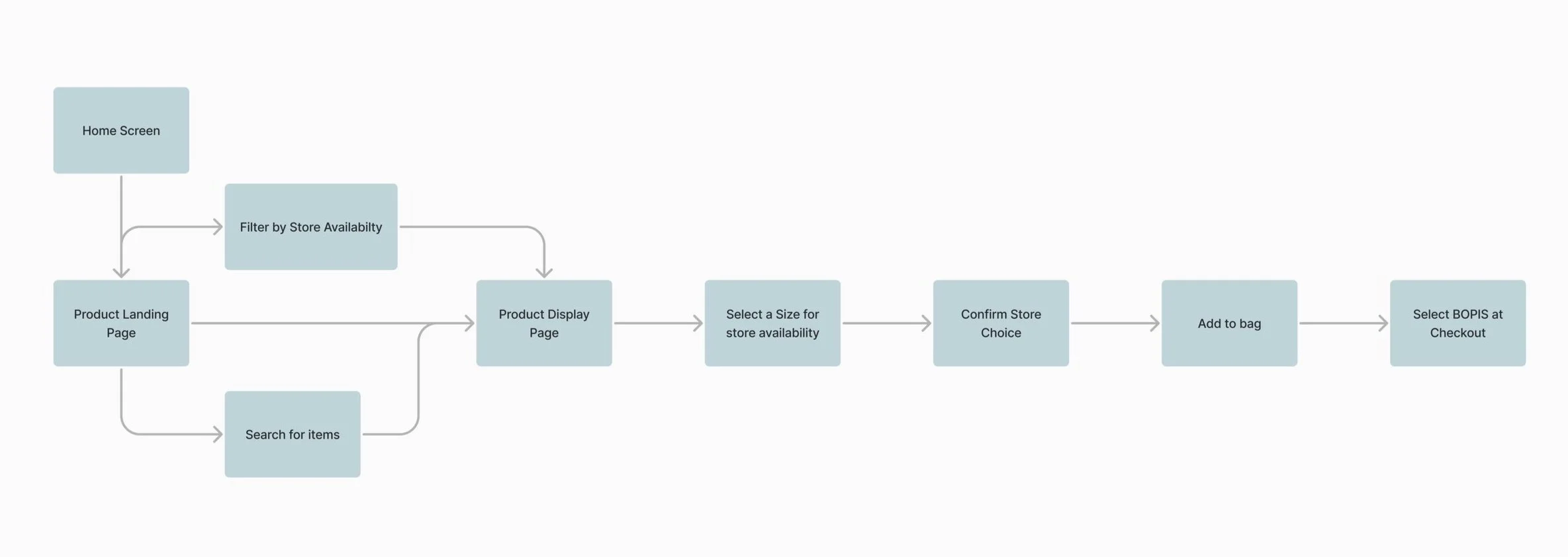
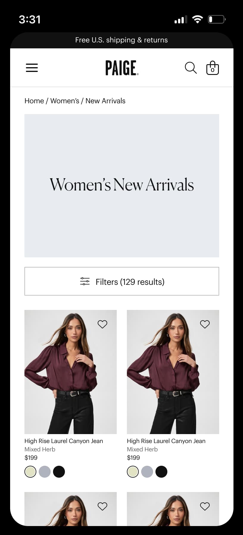
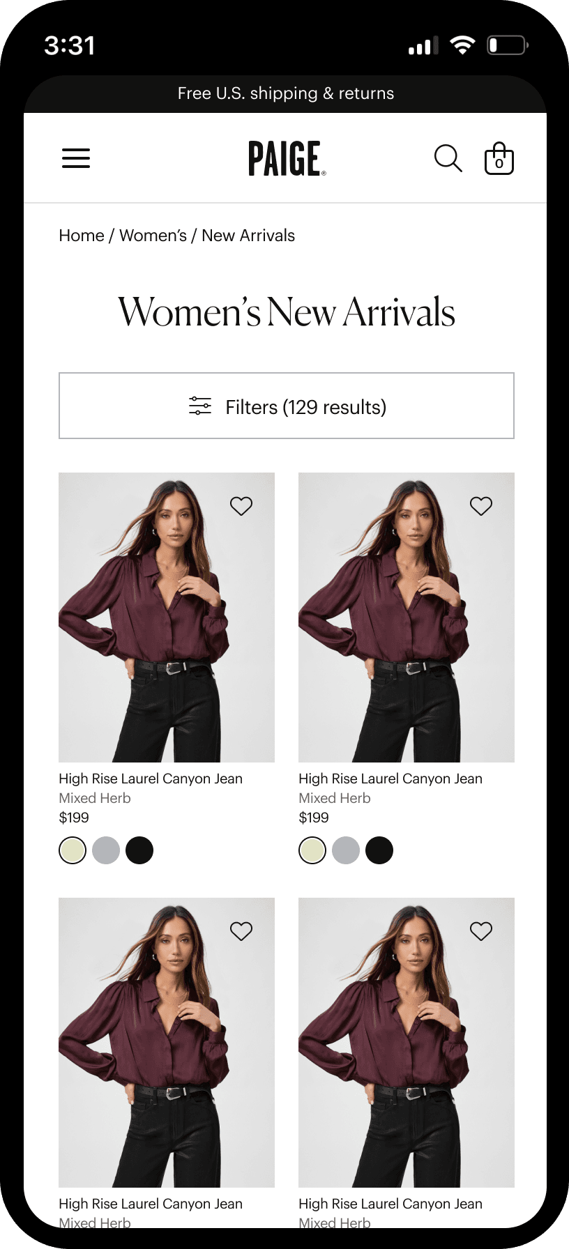
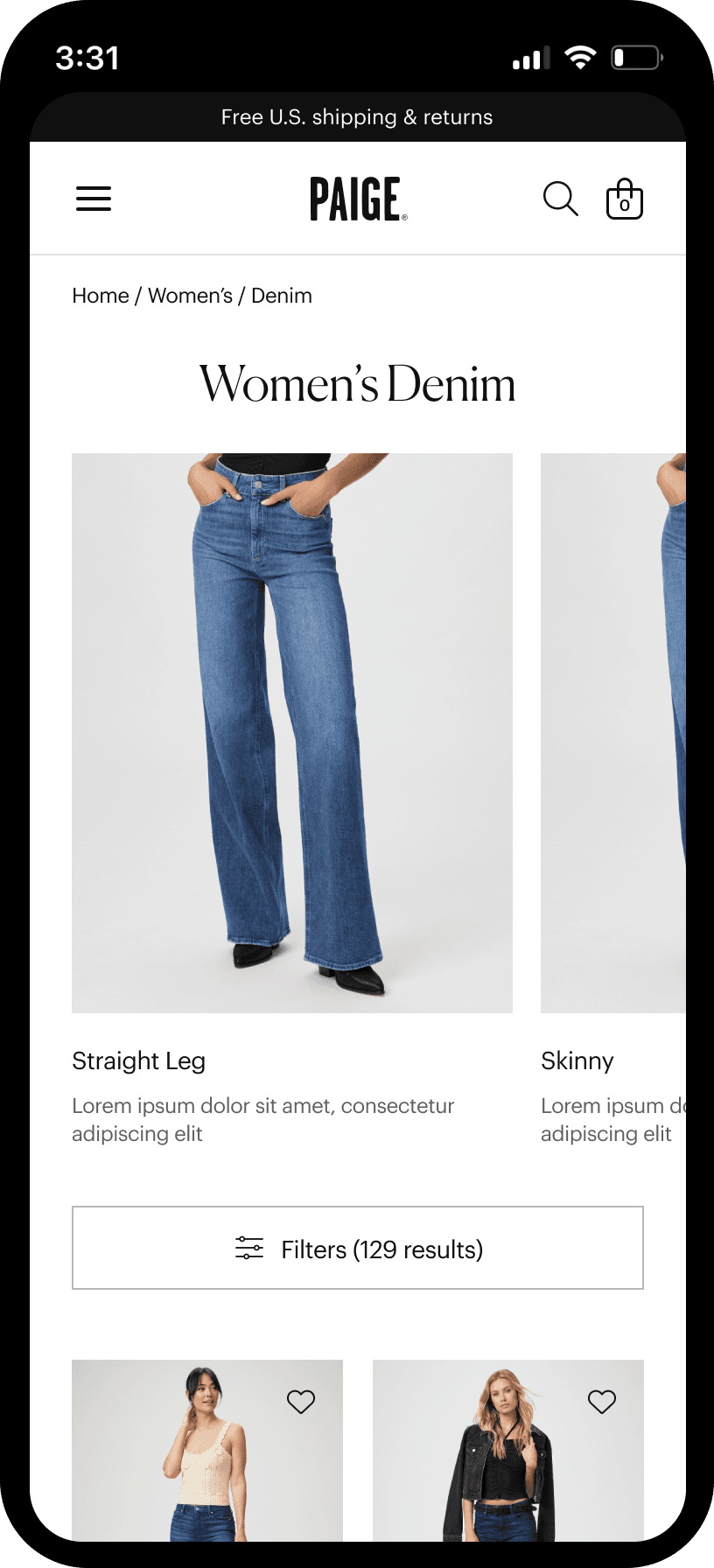
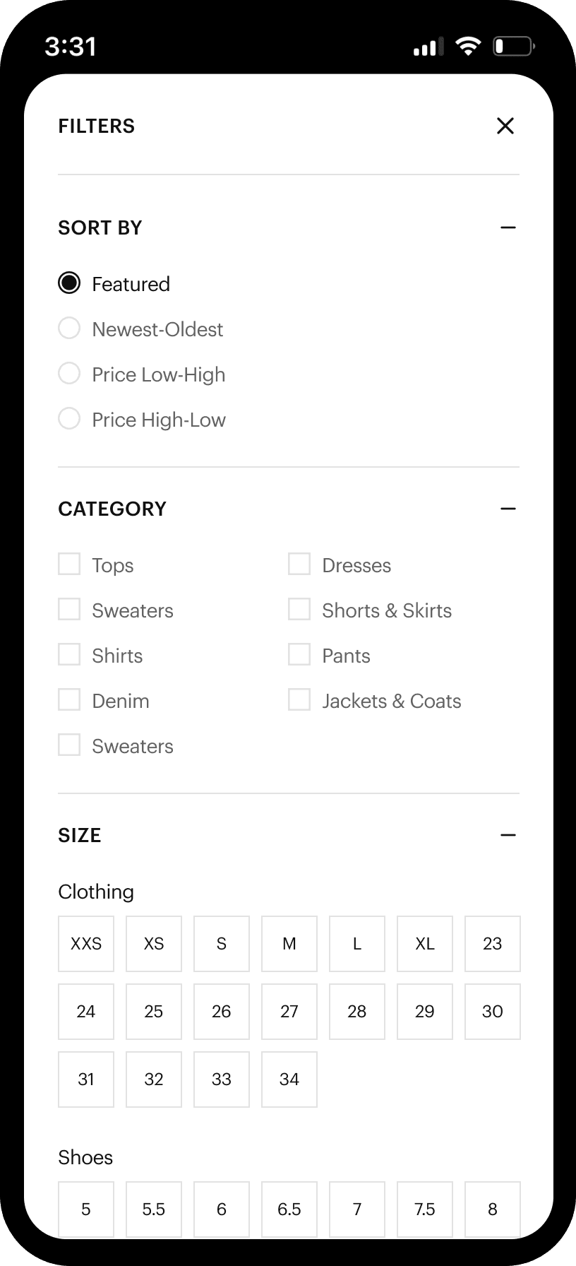
Product Landing Page
The PLP was redesigned to introduce product-level information and filtering that did not previously exist, enabling customers to better evaluate and narrow products directly from the listing page. The new PLP established a mobile-first structure that supported clearer scanning, comparison, and discovery, while creating a flexible foundation for future merchandising and content needs.
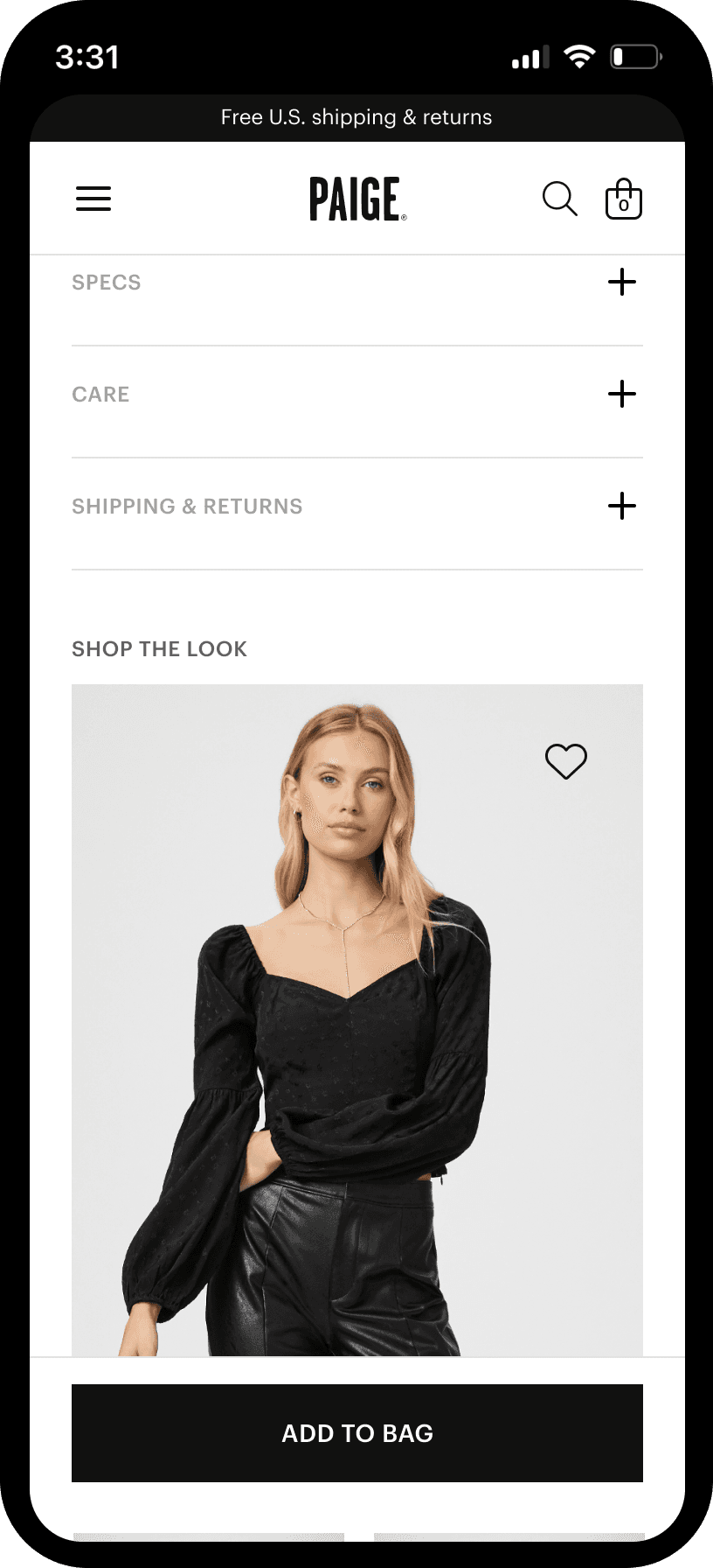
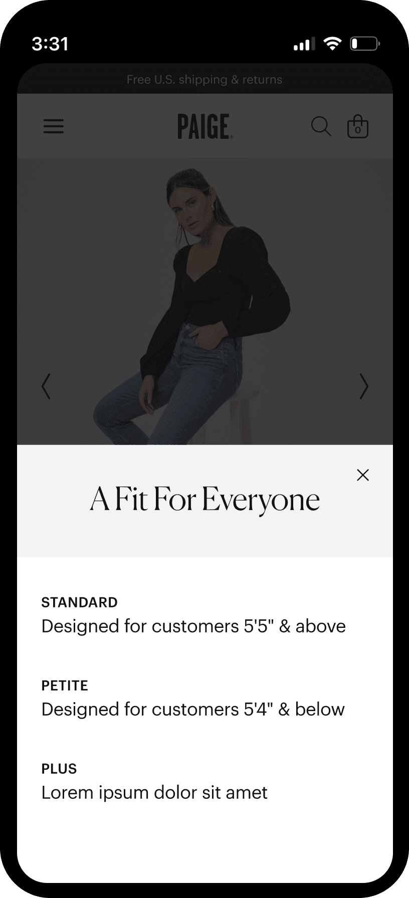
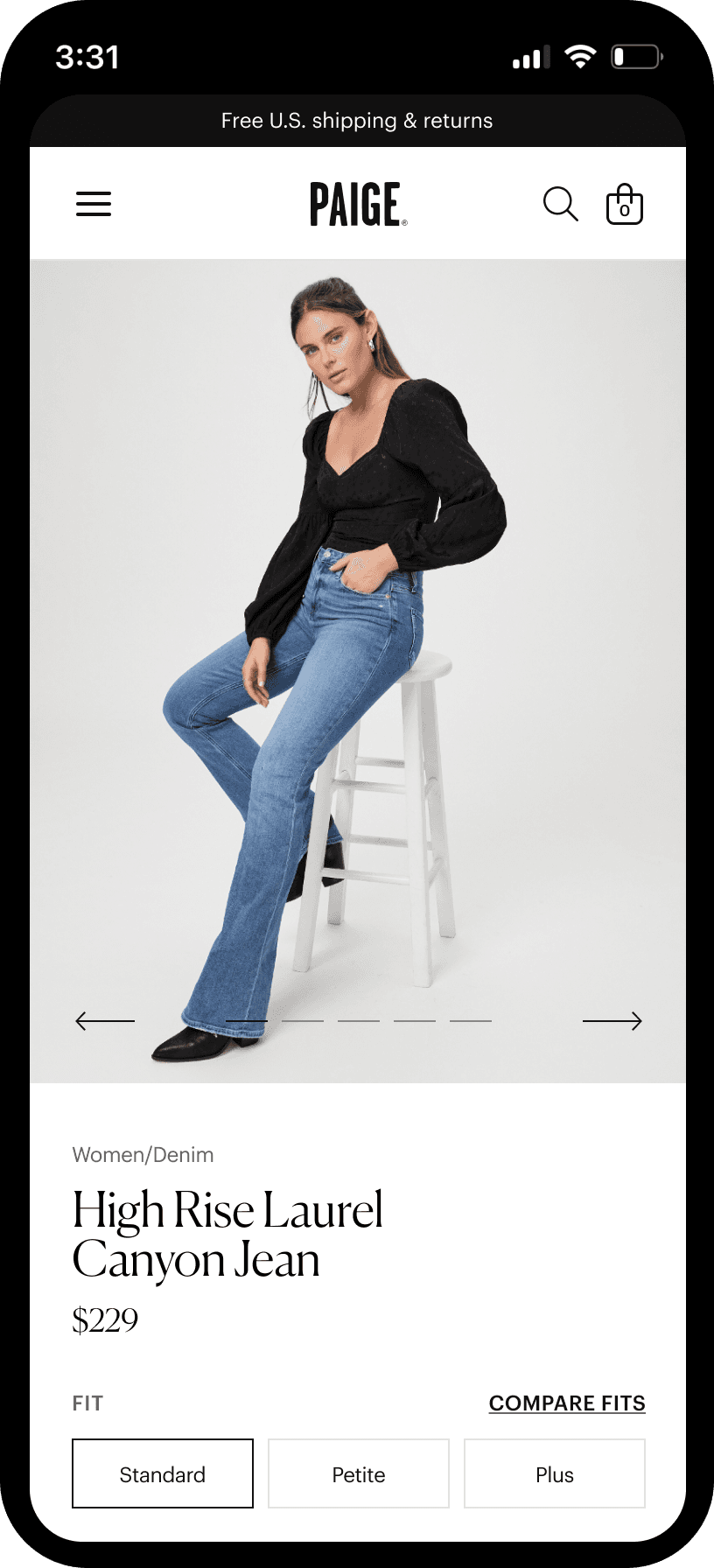
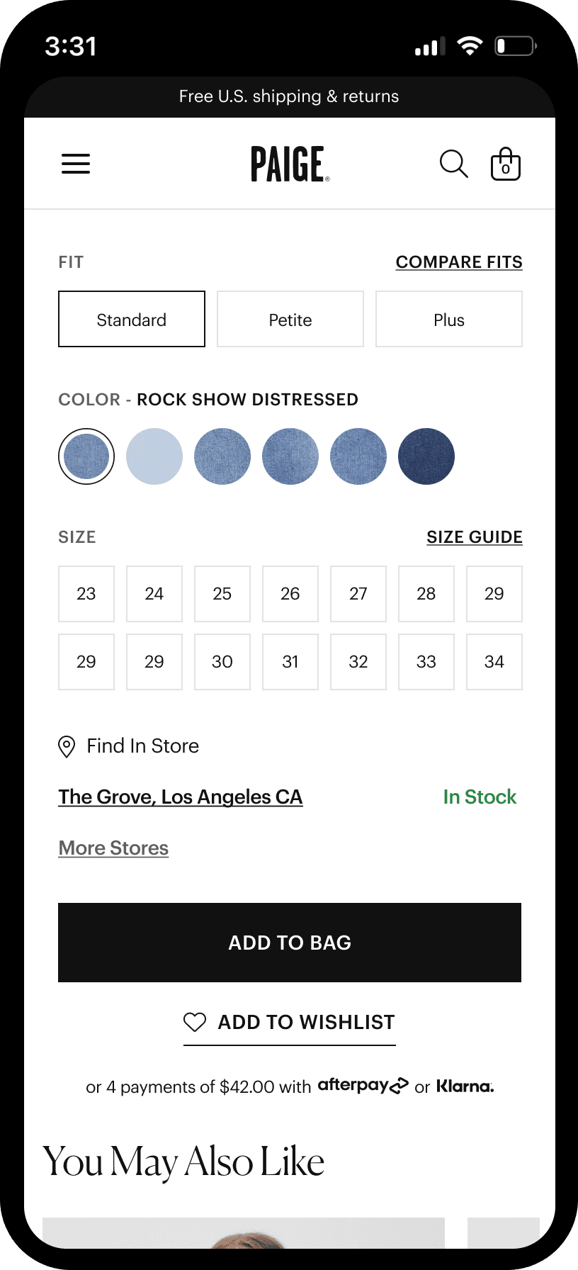
Product Display Page
The PDP experience was redesigned to better support product evaluation and conversion, with a focus on mobile-first clarity and usability. Key product information, availability, and fulfillment options such as BOPIS were integrated in a way that reduced friction and helped customers move confidently from interest to purchase.
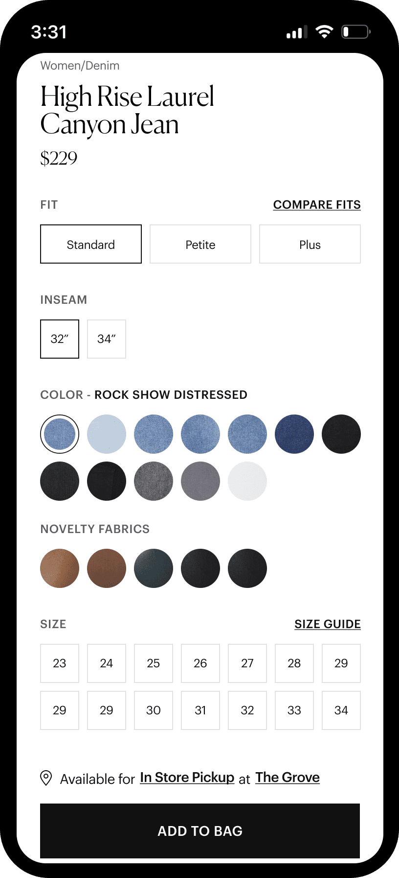
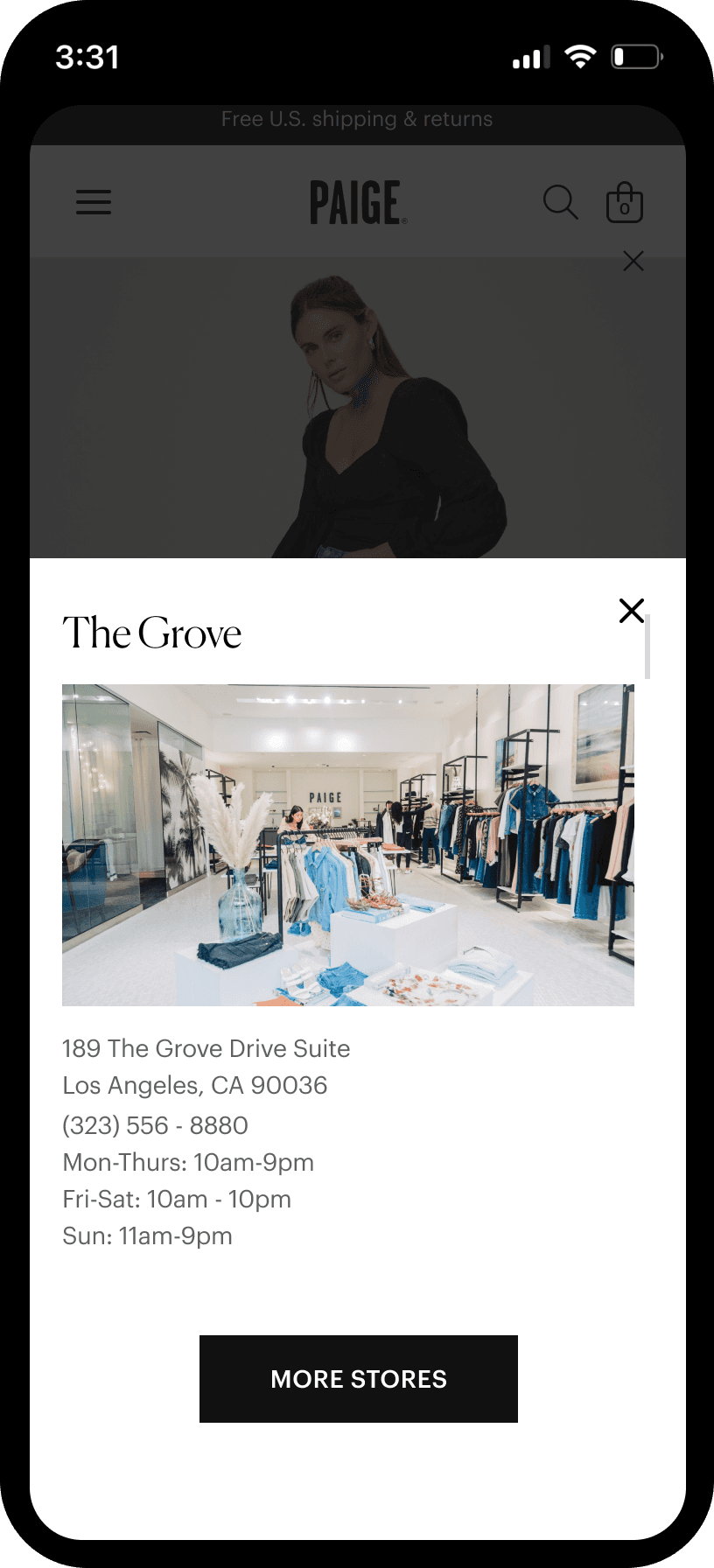
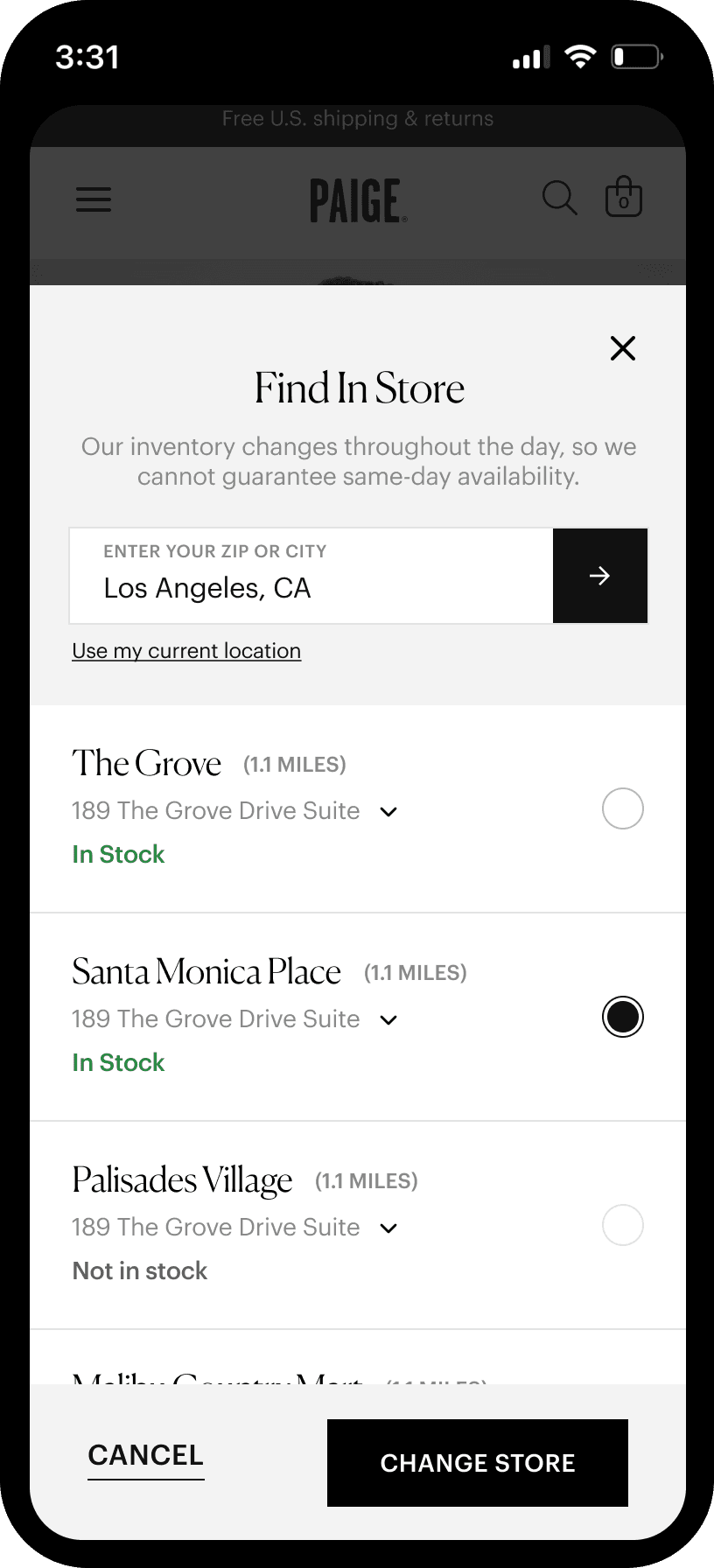
BOPIS
One of the most sought-after features for the new site was the Buy Online, Pickup In Store option. The BOPIS flow was designed with a mobile-first approach, prioritizing mobile as the future of e-commerce. The experience focused on surfacing store availability at the right moment in the shopping journey and making the pickup option feel seamless alongside standard shipping.
Next Project
The RealReal →