I lead UX/UI across five DTC beauty brands, driving conversion through design.
At AS Beauty, I manage UX/UI across five DTC brands including Cover FX, Julep, and Mally Beauty—with the majority of my work focused on leading the full redesign and Shopify 2.0 migration of the Laura Geller site. This overhaul delivered a +15% lift in conversion and +31% increase in checkout completion, supported by a mobile-first design system and flexible modular templates that accelerated launches and standardized styling across all brands. I directed 94+ A/B tests to implement winning UX patterns (promo display, mini bag, quick shop) and oversaw 350+ new on-model images to elevate PDP clarity and product storytelling. I also partnered closely with Development, Creative, and Brand teams to replace outdated code, streamline content updates, and build a scalable foundation for ongoing enhancements across the portfolio.
AS Beauty
UX/UI Design Manager
2024
Improving the Laura Geller Experience
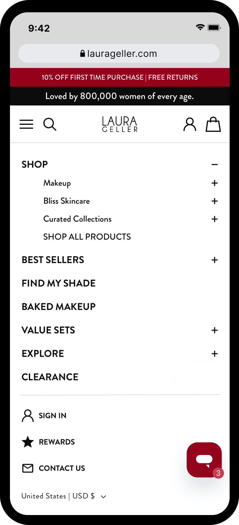
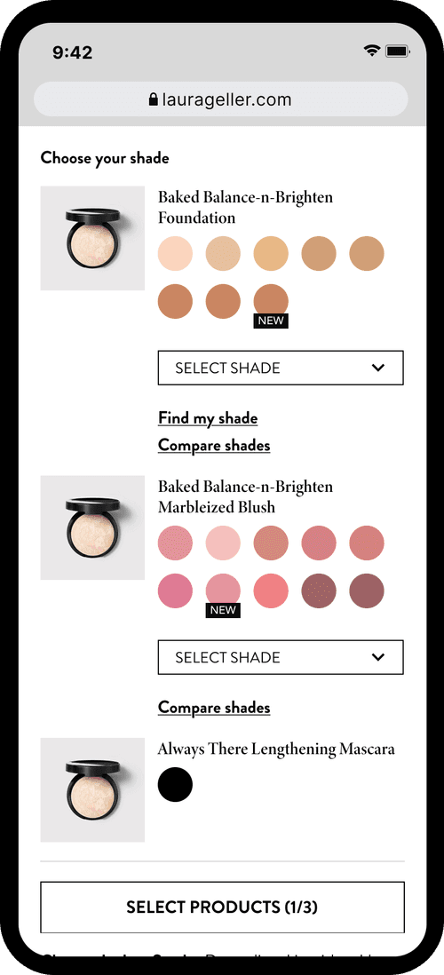
I led UX improvements across the Laura Geller ecommerce experience with a focus on reducing friction, improving product discovery, and driving conversion. This work included redesigning desktop and mobile navigation as distinct, purpose-built experiences; enhancing PLPs with filtering and richer product information; and optimizing PDPs to better communicate value, shade selection, and key benefits. I also supported the design of conversion-driving features such as Shade Finder, Bundle Builder, and Try-Before-You-Buy, while contributing to Shopify 2.0 migration, ADA compliance, and ongoing experimentation. All improvements were grounded in user behavior, ecommerce best practices, and scalability to support long-term growth.
Ideating Flows & Testing
I mapped end-to-end user flows across navigation, PLPs, PDPs, cart, and checkout — optimizing paths for both new and returning shoppers with a mobile-first mindset. Every design decision was validated through A/B testing, performance data, and direct user feedback. I partnered with optimization teams to run experiments across the funnel, using statistically significant results to drive iteration rather than assumptions.
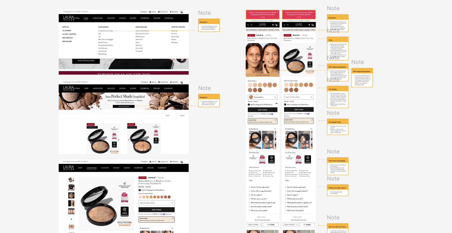
Navigation
Navigation design for Laura Geller required a thoughtful approach to taxonomy, as the brand's product assortment and shopper mindset differ from traditional beauty experiences. Desktop and mobile navigation were intentionally designed as distinct systems, each optimized for platform-specific behaviors. The taxonomy and structure were crafted to support both goal-driven shoppers who know what they are looking for and exploratory users who want to browse, learn, and discover products. By balancing speed, clarity, and discovery, the navigation experience reduced friction while encouraging deeper engagement across the site.

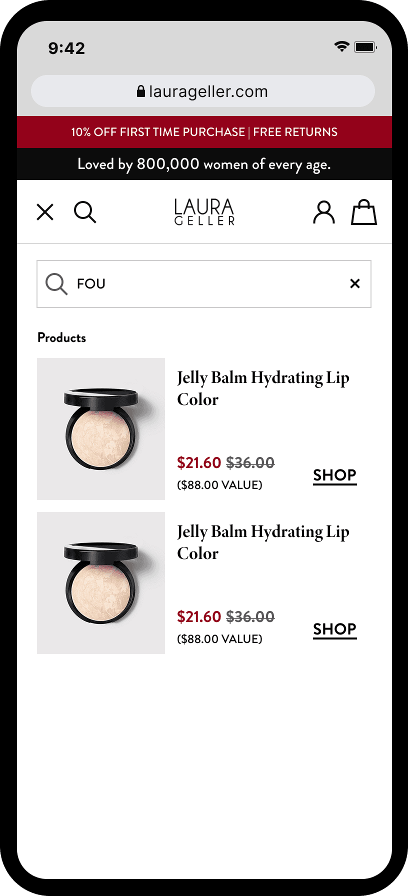

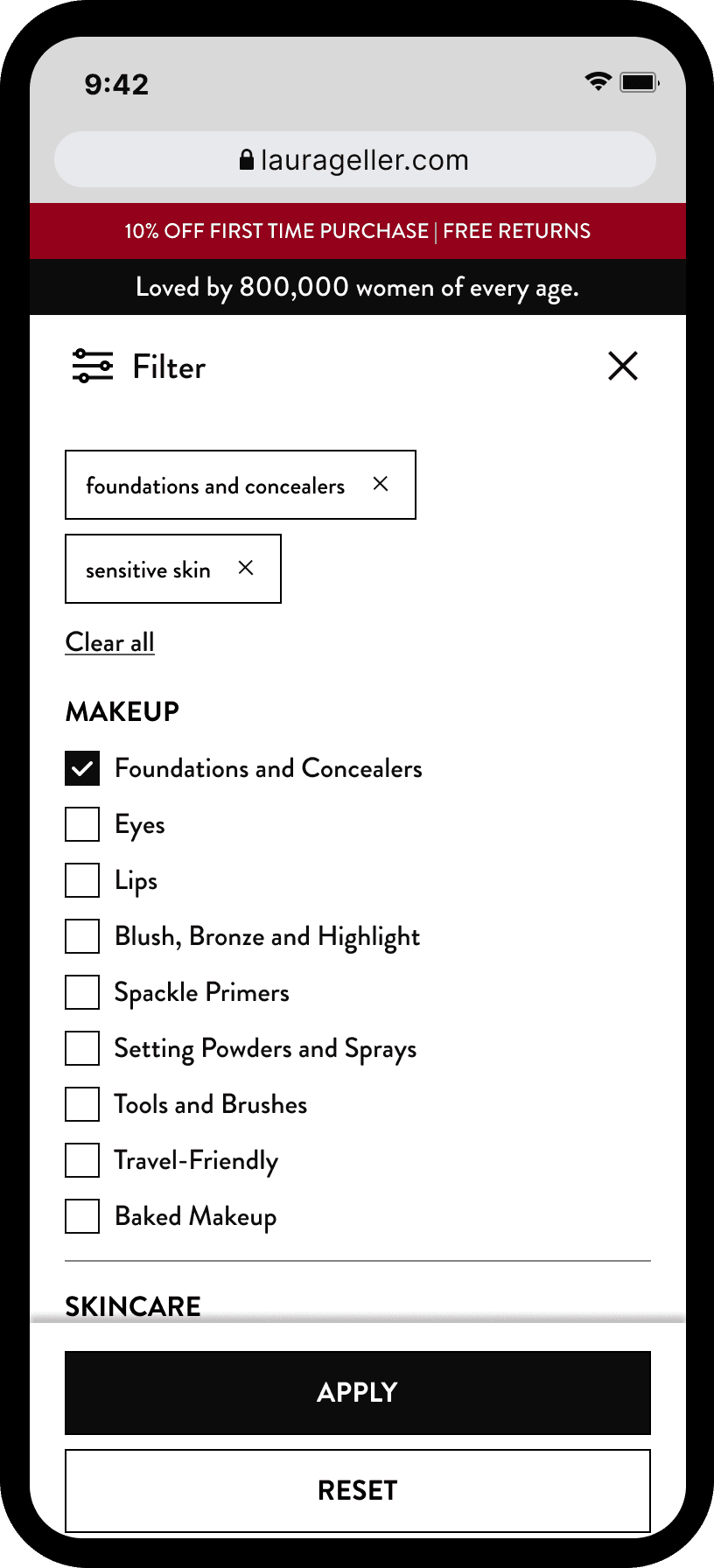
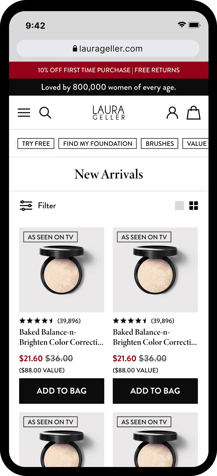
Product Landing Page
The PLP experience was redesigned to better support product discovery, comparison, and confident decision-making. Previously limited in functionality, PLPs were enhanced with filtering, sorting, and richer product information to help users quickly narrow options and understand key differences between products. The layout and hierarchy were designed to balance scannability with education, allowing shoppers to efficiently evaluate products while still encouraging exploration. These improvements reduced friction between navigation and PDPs and created a more effective bridge from browsing to purchase.

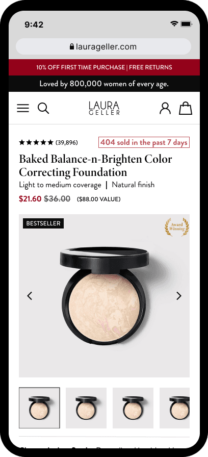
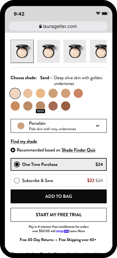
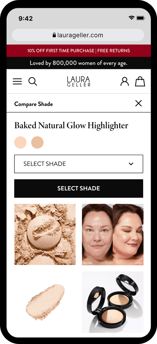
Product Display Page
PDPs were redesigned to better support education, trust, and conversion by clearly communicating value, benefits, and shade information at key decision points. Layouts and content hierarchy were optimized to surface the most important information early—particularly on mobile—while accommodating longer-form content for users who needed deeper education. Sticky CTAs, improved visual hierarchy, and clearer messaging reduced friction and supported confident purchasing. PDP decisions were continuously refined through CRO insights and user feedback to ensure the experience aligned with real shopper behavior and conversion goals.
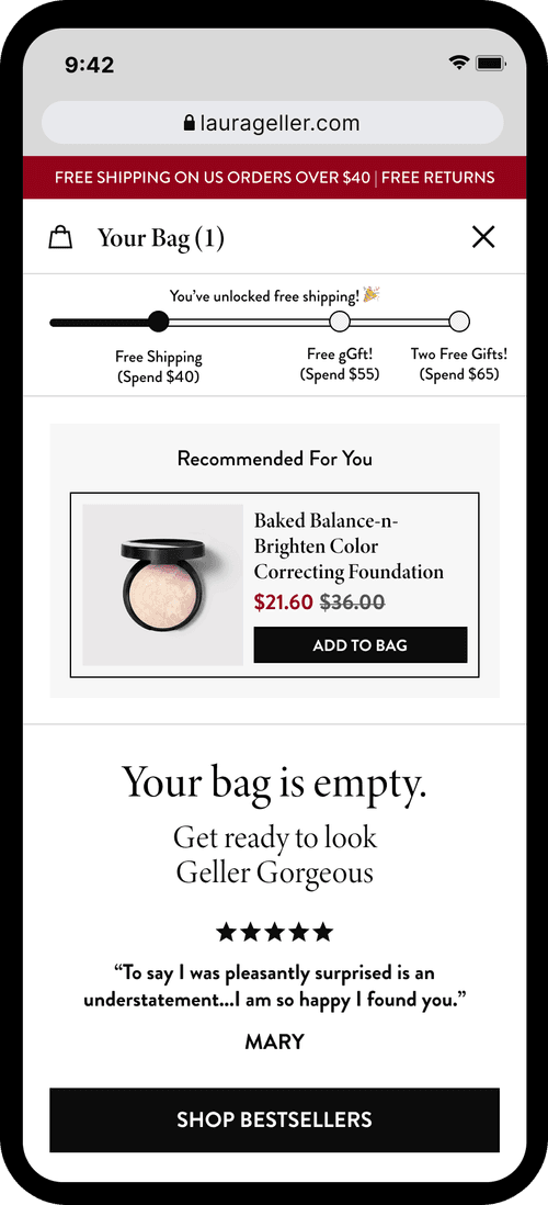
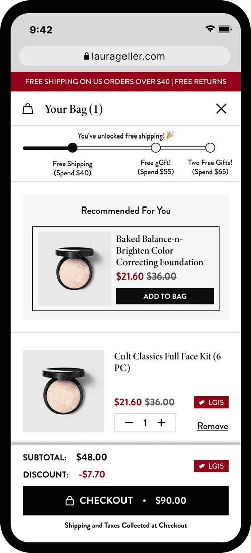
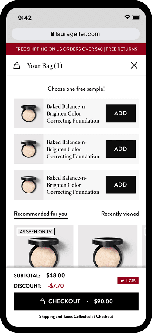
Cart
The cart was treated as a key conversion driver, not just a review step. Designs focused on reinforcing value, clarity, and urgency through improved pricing transparency, promotional visibility, and incentive placement. Continuous A/B testing and user feedback informed iterations, ensuring cart decisions were driven by performance data and optimized to push users confidently into checkout.
Coming Soon: Find Your Shade
Shade Finder is currently being optimized to reduce shade uncertainty at the PDP, one of the site's highest-friction points. Many users reach the product page unsure of their shade and miss the Shade Finder CTA, so the focus is on improving visibility and placement while refining the flow to increase confidence at key decision moments.
Next Project
PAIGE →